

Microsoft Excel provides a great way to summarise and analyse data using charts. The terminology used can differ between referring to them as charts or an Excel graph. Either way it is the charting feature within Excel which will create these eye catching visual represeation of your data. Charts allow you to highlight important information or trends that occur.
I’ve said this before and I’m sure I’ll say it plenty more times but I’m a visual person and have always found it easier to identify and understand data presented in a graph rather than reading rows and rows of data.
A common issue I have heard over the years is that users find that the chart they have created does not correctly display the information in the way it is intended. Generally, this is caused by the wrong type of chart being used and so with some minor changes, you can adjust your chart to ensure the data is presented in the most suitable and effective way possible.
Excel provides many different chart types to choose from and within those chart types, you have many different layout options including 2D and 3D charts.
Chart types include:
- Column or Bar Charts
- Line or Area Charts
- Pie or Doughnut Charts
- Treemap or Sunburst Charts
- Histogram or Box and Whisper Charts
- Scatter or Bubble Charts
- Waterfall, Funnel or Stock Charts
- Combo Charts
In this post I want to show you how to create a quick and easy chart using Excel, in fact, you can insert a chart into Excel in less than 30 seconds. This never ceases to bring a smile to the face of those who dread charts during a training session. I will also give you some tips on ensuring your data is set up correctly.
Set up your data
Often the problems that are encountered when working with charts are caused by incorrectly formatting the data which is being used to create the chart. A few common mistakes are shown below along with explanations:
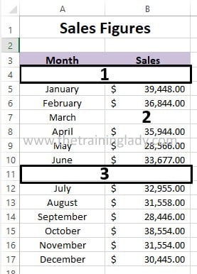
- Issue 1 is the blank row underneath the headings. Excel will interpret this blank line as the headings for your axis. Always ensure there are no blank lines between your headings and data.
- Issue 2 is a blank cell within the data area. Excel will interpret this as part of your data and will include a value of zero in your data for this row. This also applies to blank columns in between your data.
- Issue 3 is an empty row. Ensure all data is completed and is not left blank or this again will be included as a zero value in your chart. Alternatively, Excel may also interpret this empty row as the end of your data area and will not automatically include data from row 12 onwards in your chart.
Create a chart in under 30 seconds
Now it’s time to create a chart in under 30 seconds. Thankfully the process to create a chart has been dramatically improved with each of the latest versions of Microsoft Excel and I’m going to show you how to create a chart with 1 mouse click and 1 press of a key on your keyboard.
- Firstly open Microsoft Excel
- If you have some data you wish to use for this exercise press Ctrl + O on the keyboard and locate/open the file
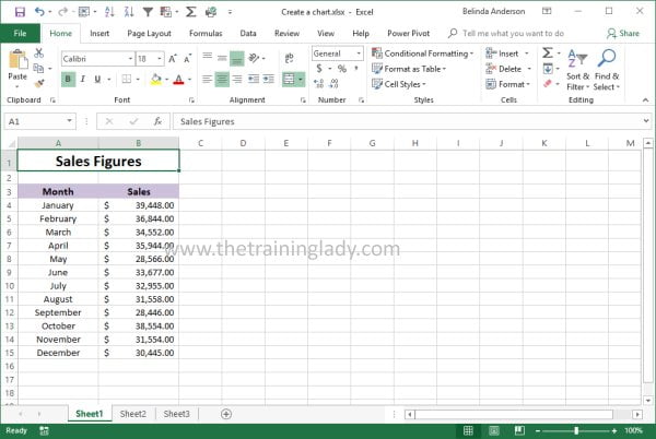
- If you do not have a file to use simply create some sample data such as the content shown below:
- Many users believe they need to highlight the data they want to include in the chart first, but Excel has gotten smarter over the years and you do not need to do that anymore.
- Simply select any cell within the data area.
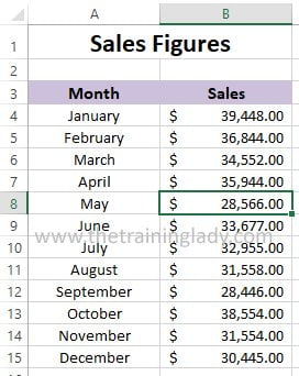
- Now on the keyboard press the F11 key.
- Voila a column chart is now displayed on a new worksheet within your workbook.
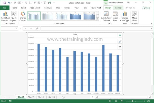
- You can now use the Chart Tools to modify the chart where necessary.
This method of creating a chart is quick and easy but obviously if you want to use a different chart type this may not be ideal but it’s a great start and certainly gives you a quick result.
If you like charts, you will love Sparklines so be sure to check out articles on:
- Create a Sparkline to show data trends in Excel
- Customise a sparkline in Excel
- How to create a Pivot Table in Excel
Leave any questions or comments below.


One Response
Hi Belinda, I was trying to create a pie chart to link to 1 column in an excel spreadsheet with (Repair type) drop downs to form the chart. I could not do it and must be missing something, any idea’s. This is an example of what I’m talking about below. There are 7 dropdown selections in the repair type column.
Component changed Date Name Repair type
Front Diff 29/12/2021 Ben Essery Drive train
Park brake unit 6/02/2022 C. Port Hydraulics
Scubber pump 27/03/2022 G Neville Air system
Front panhard rod 2/06/2022 R Lawrence Frame
Front driveshaft 2/06/2022 R Lawrence Drive train
Rear driveshaft 2/06/2022 R Lawrence Drive train
Rear panhard rod bushes 2/06/2022 R Lawrence Frame
Accumulators 3/06/2022 R Lawrence Hydraulics
Thanks.