
For those that are new to Pivot Tables, or PivotTables in Excel, a pivot table allows you to summarise, analyse, sort, group, sum, count, total, and calculate data all with a few simple steps. Pivot tables can seem quite daunting to users who have not used them before.
Learning how to create a Pivot Table in Excel is one of the most useful skills you can have when working with large amounts of data. Pivot tables offer a vast range of benefits that significantly enhance data analysis and reporting efficiency.
One key advantage is their ability to quickly transform large sets of data into meaningful insights. By dragging and dropping fields into designated areas, you can rearrange and summarise data in different ways, enabling quick identification of trends and patterns.
Why use a Pivot Table versus other Excel features?
Using a Pivot Table over other Excel features often comes down to the need for dynamic and versatile data analysis. Unlike traditional data analysis methods, such as sorting and filtering, Pivot Tables provide an interactive approach to organising and/or summarising information. Pivot Tables “excel” (pun intended) in handling large data sets by offering a quick and intuitive way to pivot, filter, and manipulate data.
While functions like charts are excellent for visualising data, Pivot Tables allow you to delve deeper into the numerical details and gain valuable insights. You can easily rearrange fields, create calculated columns, and apply filters.
Create a Pivot Table in Excel
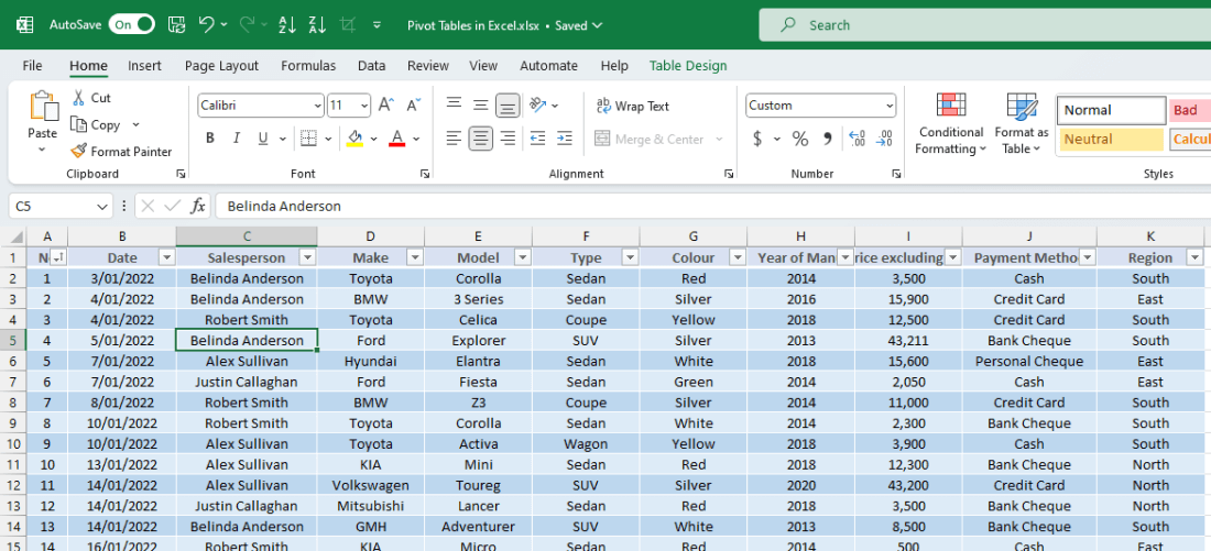
Firstly we need a dataset to work with. My data set is relatively small in comparison but I have approximately 100 records in my worksheet. For this exercise you can choose to use your own dataset or download a copy of this data.
- Open Microsoft Excel
- Open an existing workbook or the sample file from above.
- The sample data is already formatted as a table, however you don’t need to have done this for the pivot table to work.
- Make sure your cursor is on a cell which contains the data you wish to turn into a pivot table:
- Select the Insert tab from the ribbon.
- Choose PivotTable from the options (it is the first button on the left).
- The PivotTable from table or range window will appear:
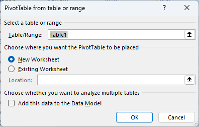
- This will confirm the data range you want to analyse and also where the PivotTable to be displayed.
- Click OK.
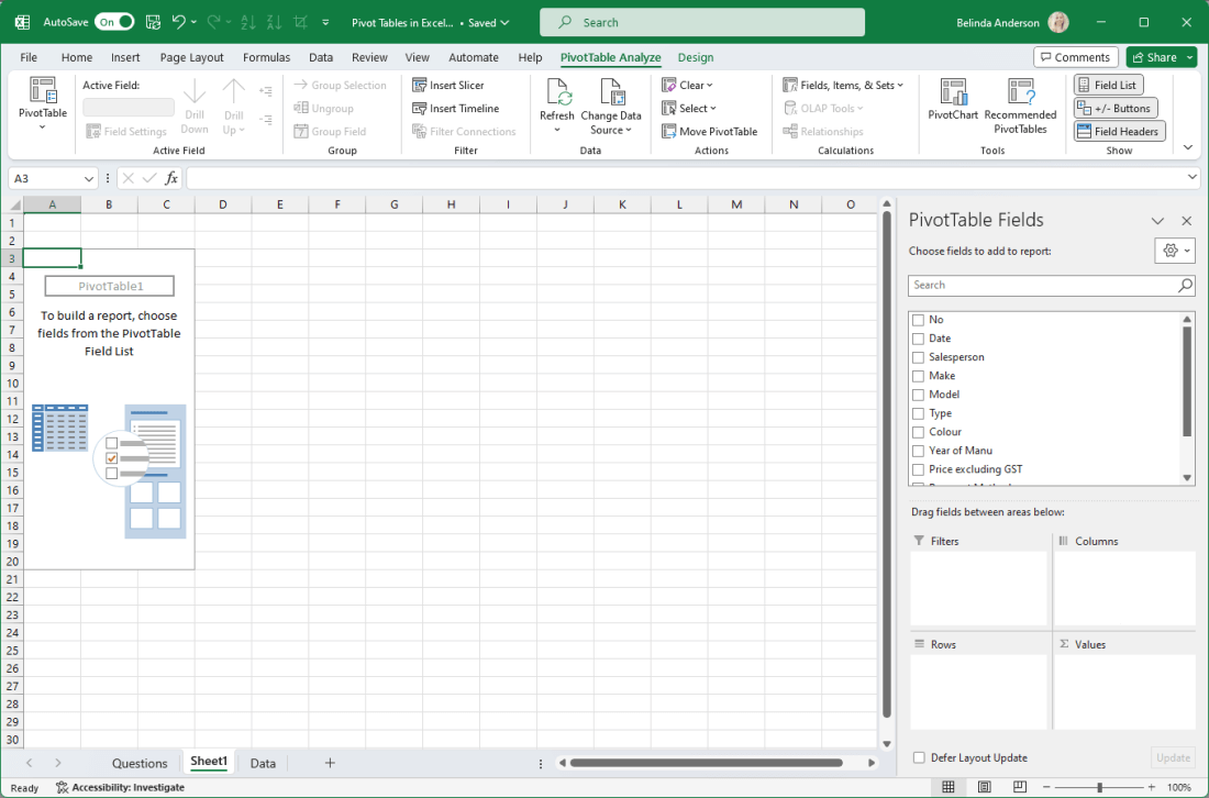
- A new worksheet will be created with a blank PivotTable area displayed:
Add Fields to the Pivot Table
Now that you have a pivot table set up and ready, you need to add the fields from your data that you wish to include in the pivot table structure. I highly recommend you have a good play with the options. There is no right or wrong location to put each field within the structure as it really comes down to how you want to look at the data. What perspective do you want to gain? Do you want a particular field displayed in columns or rows within the pivot table? Do you have a specific field you’d like to be able to filter by within the pivot table?
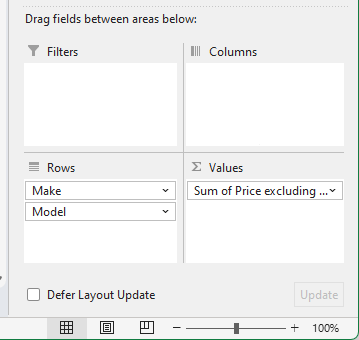
You have 4 areas to work with within the pivot table area:
- Filters (Fields go here if you want to be able to filter based on them)
- Columns (Fields go here to be displayed in column format)
- Rows (Fields go here to be displayed in row format)
- Values (Fields go here containing number values you can then calculate)
There are a few ways you can add the fields.
- tick the checkbox next to each field and Excel will automatically add them into the pivot table areas, OR
- drag and drop the fields into the area you want them displayed.
Now let’s go ahead and add some fields into the pivot table area.
- For my data I am going to add the Make and Model fields into the pivot table along with the Price excluding GST field
- If you tick the box for each field, Excel automatically adds the Make and Model fields into the Rows area and the Price excluding GST field into the Values area.
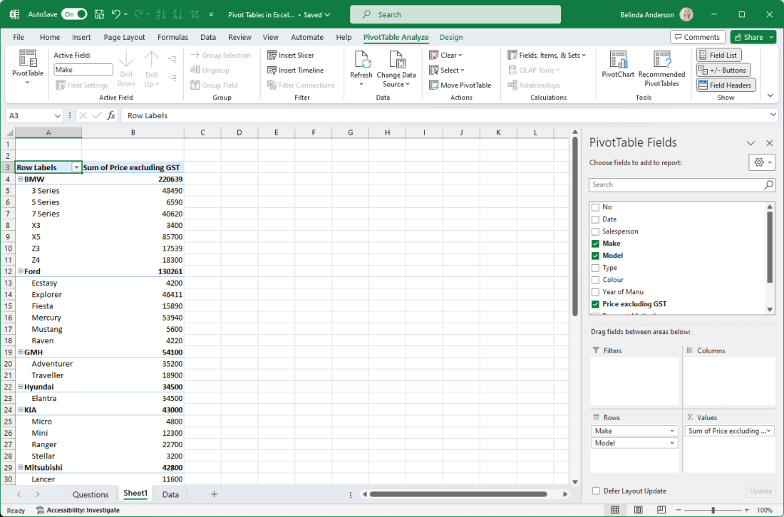
- The Price excluding GST field being added into the Values area automatically means the Sum function is applied to the field data. I can see the total sum for each Make and Model in my data.
- If you look at my Rows area, the Model field is first in the list with the Make being second. Excel is starting with the first field and then using the second field in that area as the second level field. In this instance I want to change it so that it groups the make and models correctly. If I drag the Make field and drop it above Model in the Rows area the pivot table will adjust the layout of the data.
Filter in a Pivot Table
At the moment I am seeing a summary of my entire data set. Maybe I’d like to see the sales figures for a specific salesperson within the business. So I’d like to filter out the other salespersons and leave the data for just one, or even two.
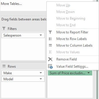
- Click and drag a field into the Filters area. In my case I am going to drag the Salesperson field into the Filters area.
- On row 1 of the worksheet I now have the Salesperson field showing with a drop-down menu in cell B1.
- I can click the drop-down menu and choose a specific salesperson to filter the data by and then click OK.
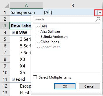
- Now I am seeing the data for Make and Model but only for the sales by Belinda Anderson (me!).
- If I want to select multiple filtering options at once, tick the Select Multiple Items checkbox and then place a tick in the box for each record you want included in the filter.
- To remove the filter, click back in the drop-down menu and choose All then click OK.
Sort data in a Pivot Table
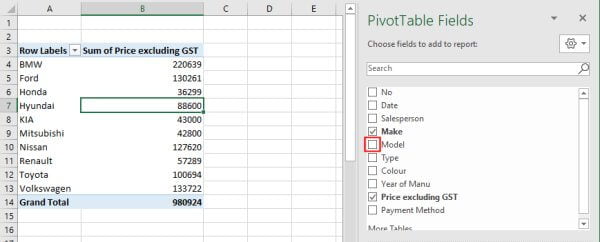
Let’s say now I want to just look at the bigger picture here and see my data across one pain field E.g. all the car makes.
- I’m going to remove a field from the pivot table.
- There are two ways to achieve this, untick the option for the field you want removed, or drag and drop the field out of the pivot table area back into the Fields list.
- I simply just removed the tick from the Model field:
- I’d now like to put this data into sort order by price (highest to lowest order).
- Quickest way to do this is using the right mouse button, right mouse click on any of the cells within the Price column:
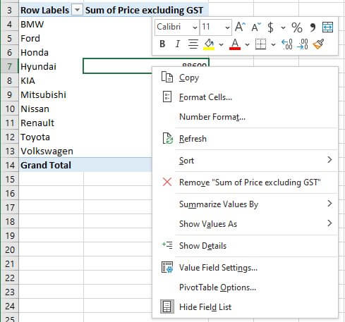
- Choose Sort > Sort Largest to Smallest.
- The data will be sorted.
Apply Number Formatting
Now that we have some data showing in our pivot table, you will see we are displaying the Sum of the Price field. At the moment it’s formatted as a plain number and I’d really like it displayed as currency with the dollar sign and decimal places. Let’s see how we can do that.
- I’ve added the Model field back into my pivot table.
- Click on the Sum of Price field in the Values area.
- The Field menu will appear:
- Select Value Field Settings from the options:
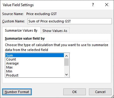
- From the dialog box click the Number Format button in the bottom left corner.
- The Format Cells dialog box will appear.
- Select the Currency category, make any changes you need and then click OK.
- Click OK again to close the Value Fields Settings window.
- The Price field will now be displayed as Currency within the pivot table.
- Be aware that if you remove the field from the pivot table and add it back in again later, the number formatting will not be applied and you will have to repeat the process.
I hope this has given you some useful tips to begin your journey working with pivot tables in Excel. Comment below if you have any questions or check out my other Excel articles here.