Microsoft PowerPoint is a fun program to use and offers many great features. Like me though many people have had the joy of sitting through a terrible presentation! It’s not fun and tends to make you want to go to “sleepy land”. In this article I want to outline my top 10 presentation tips for PowerPoint and how you can ensure your presentation keeps your audience engaged.
Tip #1: Keep it simple
This is a simple one and is one you’ll see many times on the internet if you are googling for ideas.
When a user discovers the fun tools available within PowerPoint, it can be easy to apply all of those fantastic functions into your latest and greatest presentation; however, this will not result in an amazing presentation. It will show your audience that you know how to use PowerPoint and not that you understand your topic.
Keep your presentation simple, remember the purpose of a PowerPoint presentation is to further highlight the information that you are delivering to the audience verbally. People should be listening to you rather than watching the extravagant animations, eye-popping font colours, or trying to read through the in-depth bullet points on your slides.
Tip #2: Do not use distracting background images
As much as the background image function is fantastic, do not include background images which make it impossible to read the information on your slide. If you must use a background image, ensure the image is washed out or has transparency to make your slide content easy to read.

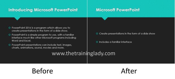
Tip #3: White space is good
Many users of PowerPoint believe they need to fill up a slide to make it look “balanced”, or so it doesn’t look empty. This is not the case. The old saying of “less is more” applies 100% to any PowerPoint presentation, so keep the content on each slide to a minimum. Your entire presentation should not be written word-for-word on each slide. Remember it should only be an important fact or aspect of what you intend to talk about during each slide.
Tip #4: Limit animations & slide transitions
Whilst animations and slide transitions have a purpose in many PowerPoint presentations, and let’s be honest, creating an animation in PowerPoint is lots of fun – check out this post for some fun! Resist the urge to animate every object, heading or bullet point on every slide. Make sure that these features are used to enhance or better your content, not just as a way to show your audience you can use these features in PowerPoint.
Tip #5: Use quality images
An image on a slide can speak a thousand words and can enhance the topic of discussion however it’s important to use quality images which will improve rather than detract from your content. Whilst anyone can do a quick Google image search and take whatever they want, you need to be aware of the copyright of these images and respect this accordingly. As an alternative, the use of professional images or “stock images” will provide a far more professional and effective image to any slide.
Images can be sourced from internal company sources such as your marketing department; or online sources including stock image websites. Better yet, if possible grab your own digital camera and experiment creating the exact image you are wanting to use. An original image is much better than a random image from the Internet.

Tip #6: Choose the right colours
Choosing the right colour scheme is an important design aspect for any presentation. Often corporate companies will determine, through style guides, a set of corporate colours which must be used and therefore this decision is removed from the design process. However, if you are not bound by corporate colours then this decision should be made at the beginning of the design process.
Do you select a dark background and light text, or do you select a light background and dark text?
Whichever decision you make it is important to ensure that your background colour and colours used for text and objects contrast each other.
A great guide I have used before is the Psychological Properties of Colours guide by Color Effects.co.uk. This guide outlines popular colours and the associated psychological effect it has on us.
Tip #7: Choosing a font
Selecting which font you will use for your presentation can often come down to personal preference. You need to remember that although you may be a fan of a particular font style, you need to look at the design of your presentation from the point of view of your audience. Will the font style be easy to read on screen?
Using a Sans Serif font style is much easier to read on screen than a standard serif font style. Below are some examples of both types of fonts.
| Serif fonts | Sans Serif fonts |
|
|
Just as there is a psychology behind font colours, different fonts can invoke different responses also. Check out this article relating to the psychology of font choices by Ted Hunt at Crazyegg.com. This is a guide I often show during web design training and it provides a great guide to the different font choices available.
Tip #8: Limit the number of slides
When creating your slides be sure to limit the number of slides you create. The number of slides is generally proportional to the length of time you have. Factors such as how much you include on each slide will also influence the number of slides. As a rule of thumb allow 1-2 minutes per slide.
Having too many slides will mean you will rush through the content to ensure you do not run over time, but having too few will leave you with time in the end with nothing to discuss, especially if you do not have any questions from the audience.
I always recommend using the Rehearse Timings feature of PowerPoint, to test out the timing of your slides and what you plan to discuss. This will help you identify if you need more or less slides or need more information to talk about.
Tip #9: Create your own design template
PowerPoint includes various built-in design templates which can be applied to a presentation at the click of the mouse. It is because of this “ease of use” that they have now become overused and are now considered “poor form” to use in a professional presentation. For people who attend conferences or workshops on a regular basis, it is usually the first thing they will notice about the presentation they are about to view. It is very easy to create your own design template using PowerPoint and will provide a far more effective message to attendees of your presentation.
For those who do not feel confident in creating their own design template, there are many websites which you can download both free and paid templates. One such website I have used is http://www.free-power-point-templates.com/
Tip #10: Spell check, spell check, and spell check again
There is nothing worse than getting mid-way through your presentation only to notice a spelling error on a slide. Regardless of the fact that you’ve spotted it, you can be sure that every person in your audience has spotted it also. Spelling or grammar errors will make your presentation look like a quick last minute addition. Be sure you run multiple spell checks on your slides before your presentation and also have a friend or colleague proofread for you.
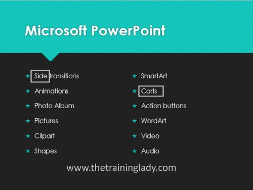
It’s also important to look for spelling errors which PowerPoint will not pick up. E.g. in the example below, the word “side” should be “slide” and the word Carts should be “Charts” so PowerPoint will not pick these up as a spelling error however it is an error within the slide.
I hope this gives you a great starting point to begin the design of your new presentation. If you are after tips for using PowerPoint, be sure to check out other related posts.


